

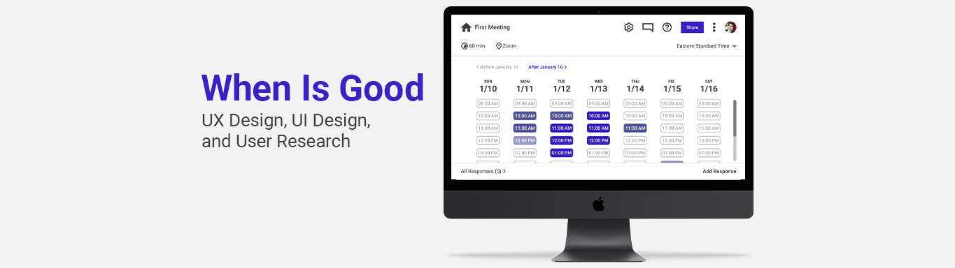
Inspired to make a more satisfying event scheduling experience for When Is Good, I created 6 high fidelity mockups and an interactive prototype to demonstrate improvements in usability and visual design.
I frequently rely on event scheduling apps like When is Good to coordinate times that are convenient for team members to meet, but these apps come with their own problems that cause frustration for myself and other users. Recognizing these concerns, I set out to improve When Is Good’s scheduling experience by identifying common pain points and crafting solutions to address them.
Because I am not affiliated with When Is Good, I would have to make inferences about the goals and expectations of various stakeholders.
Kicking off user research, I interviewed 3 working adults, gauging their general experience with scheduling events with other people. Although none of the participants that I interviewed had used When Is Good before, some of them had used similar scheduling apps previously. Some notable observations were:
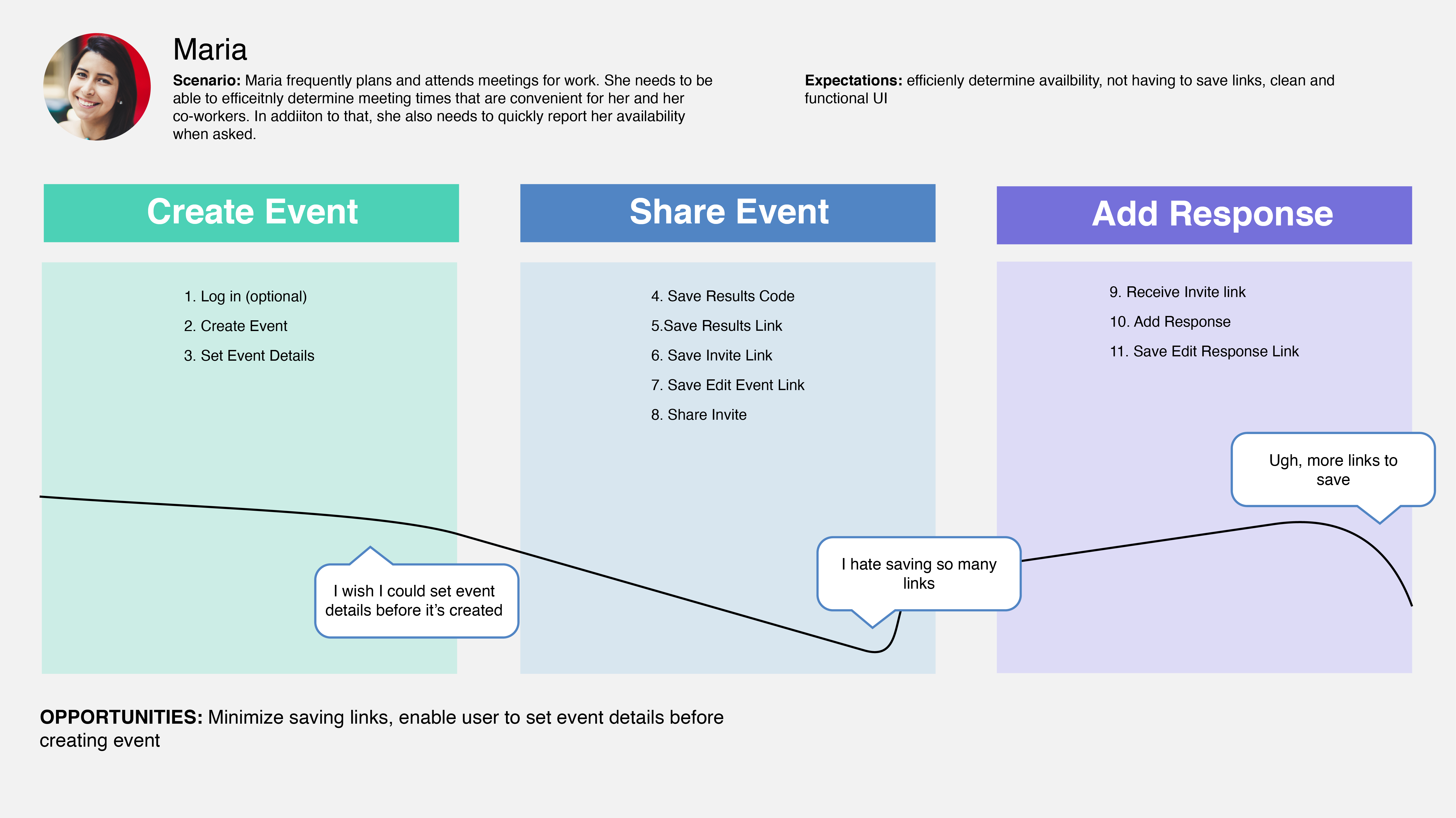
To understand what issues impede usage on When Is Good, I conducted usability testing with 2 participants, with one having used When Is Good before while the other hadn't. For this session, I asked users to complete key tasks such as editing an event's date and time and the viewing the results.
Some key observations from this process were:
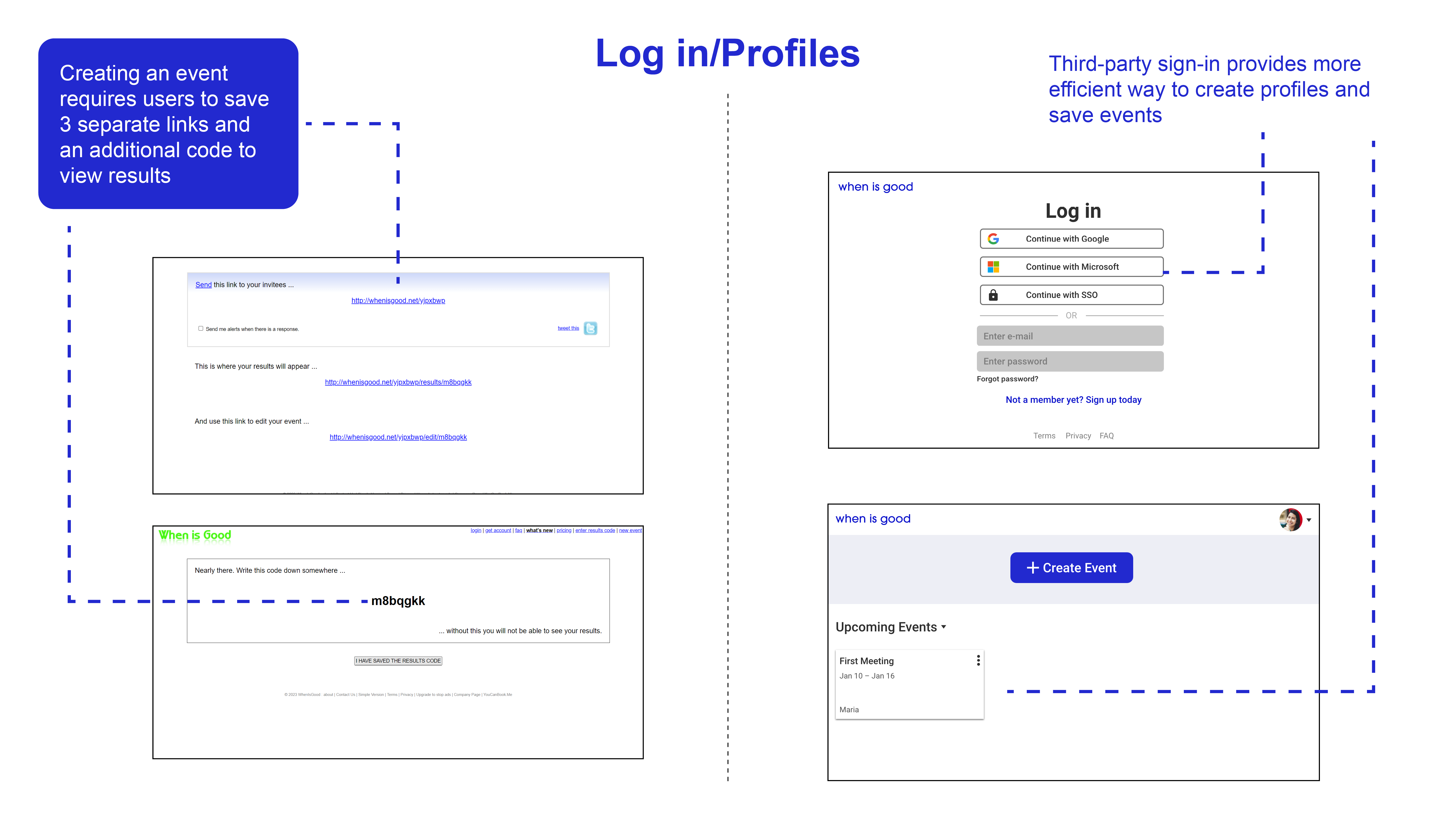
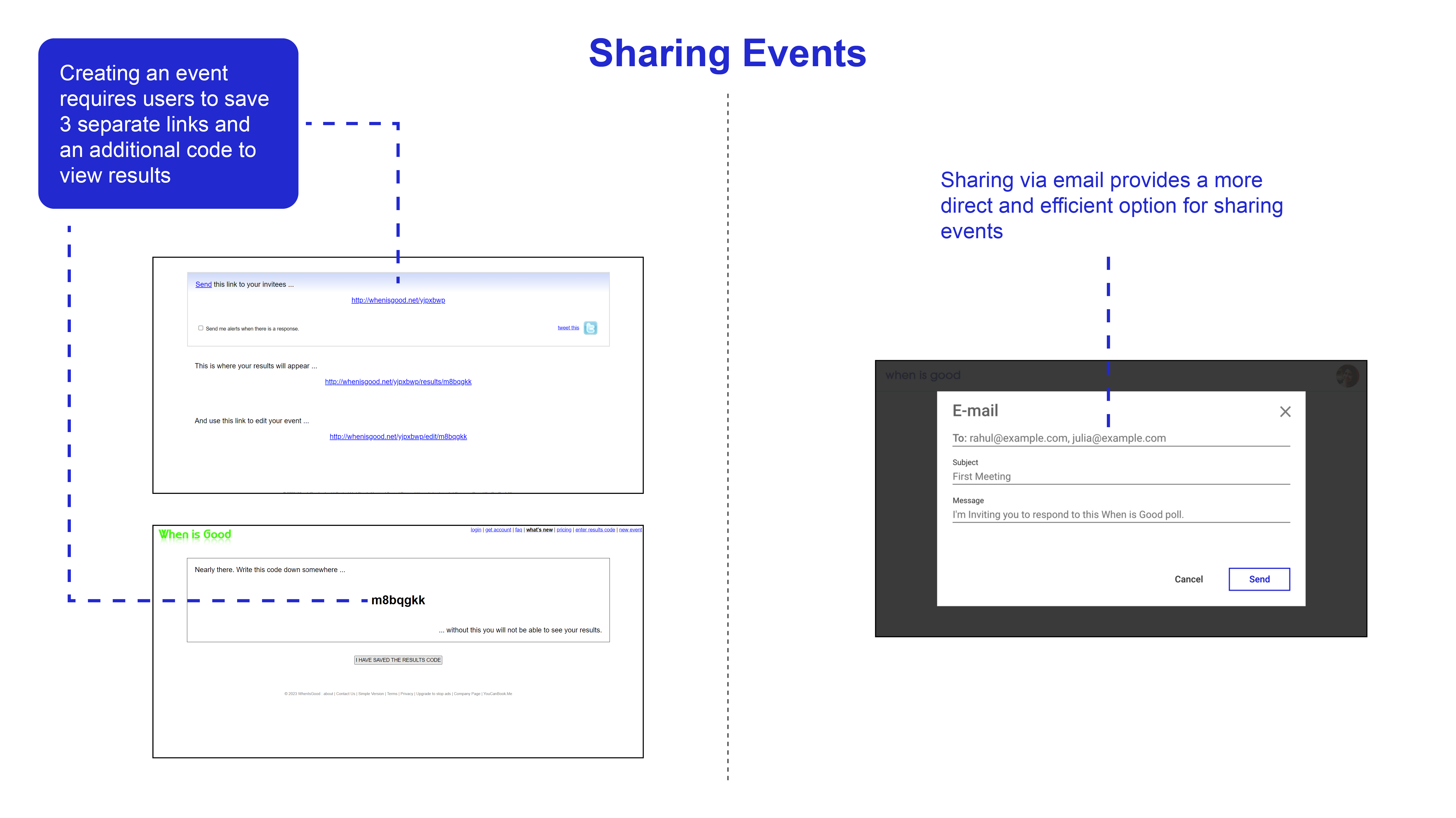
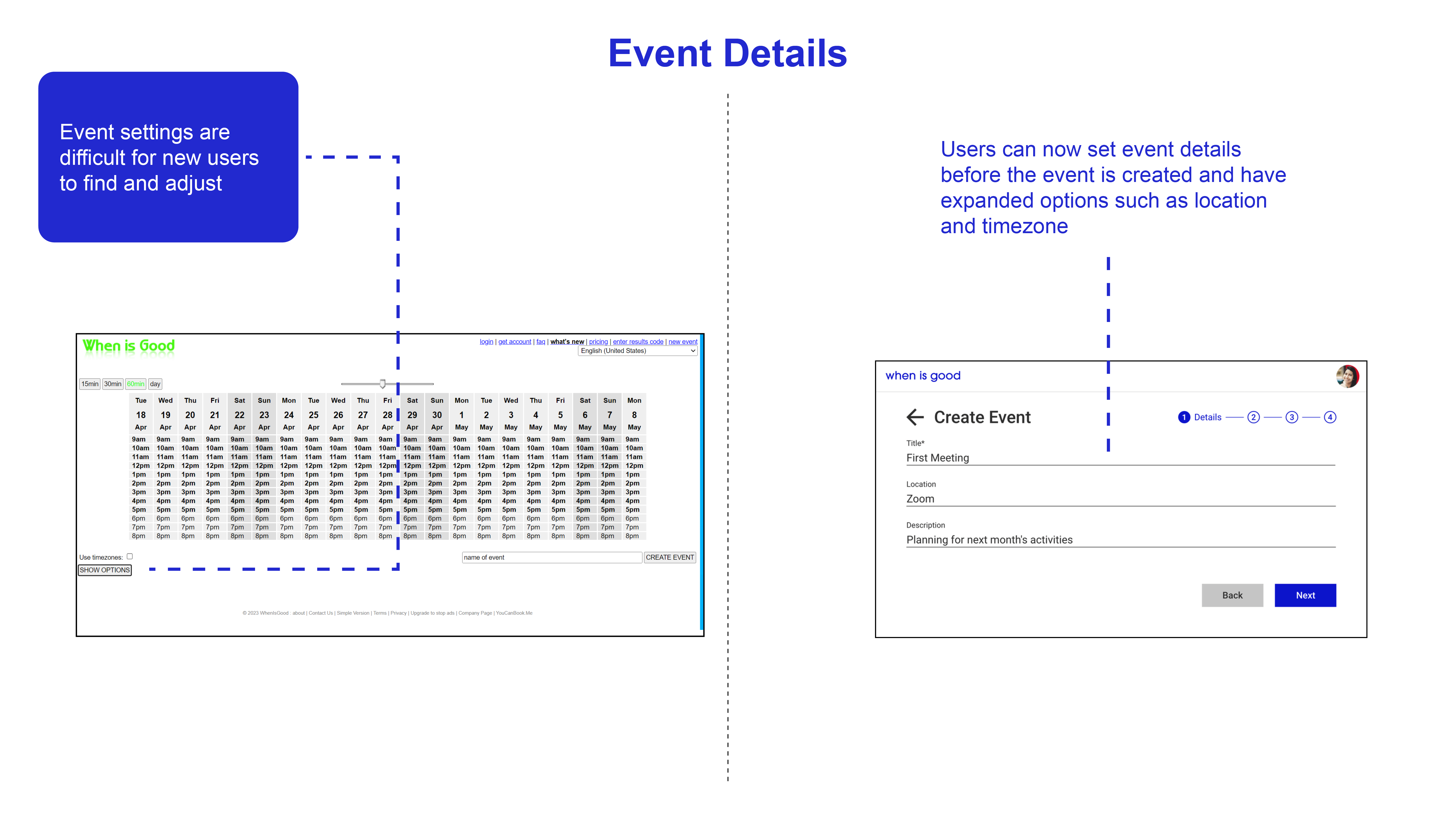
After identifying major pain points, I then started brainstorming solutions in line with When Is Good's current business goals and limitations. Given that When Is Good has historically provided a "no sign-up required" app, the solutions I conceived had to provide alternatives to existing functions without fully replacing them, such as:
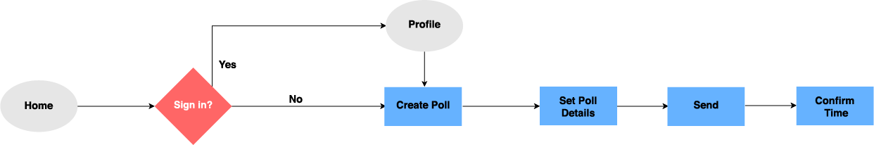
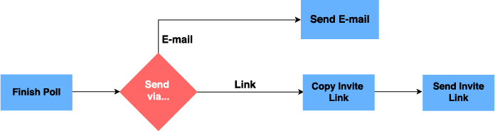
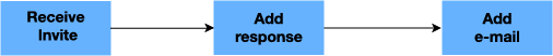
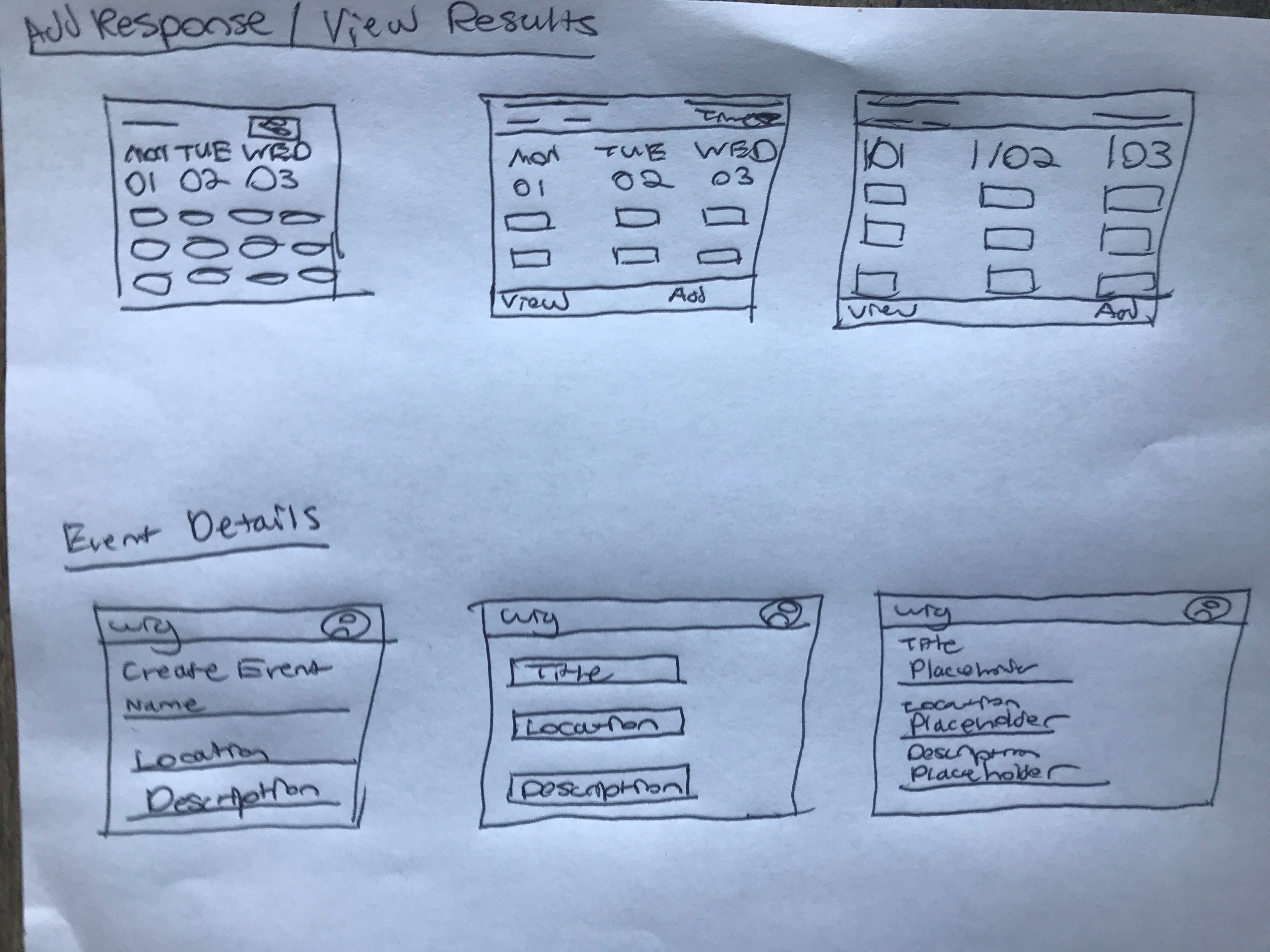
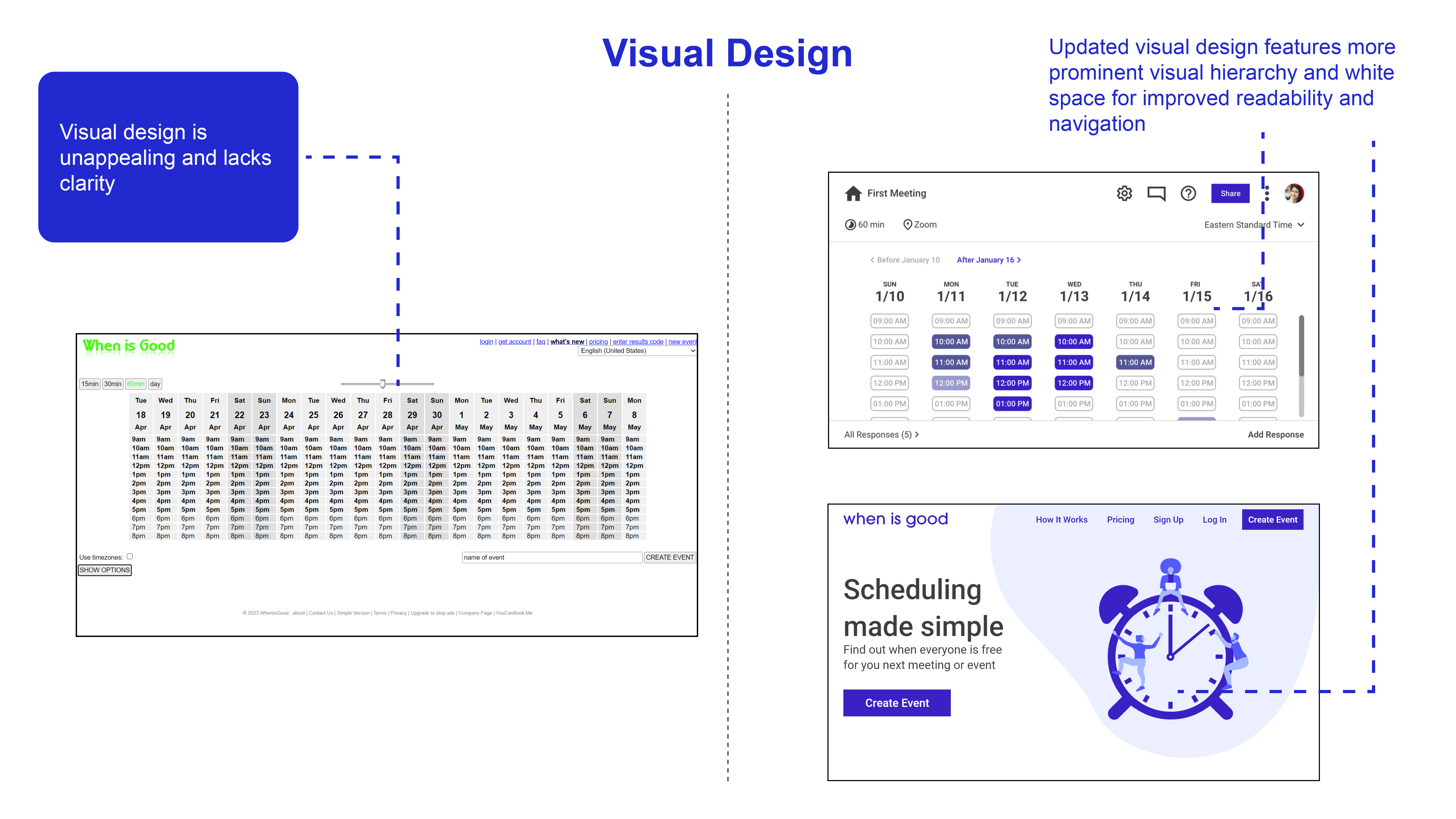
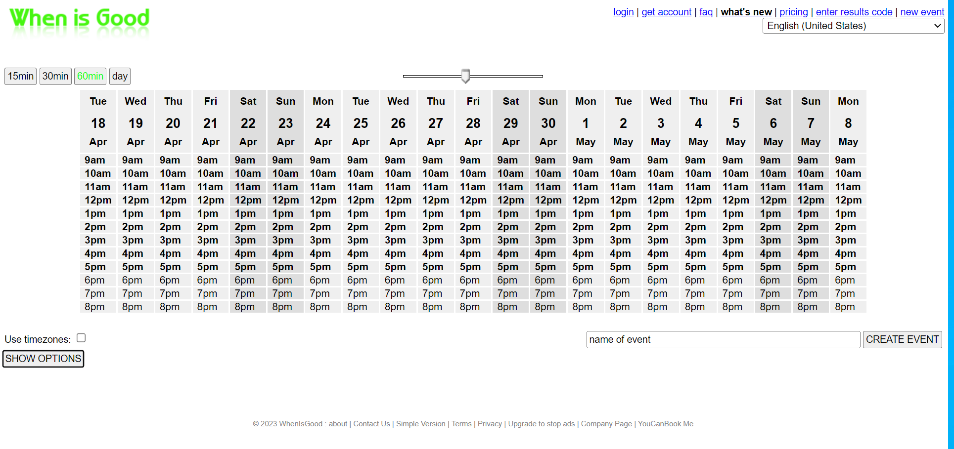
Plotting user flows then lead me to rapidly iterate upon sketches for key screens. Given that a major of goal of this redesign was to overhaul When Is Good's visual and interaction design, I worked to update existing design conventions while maintaining familiar elements.
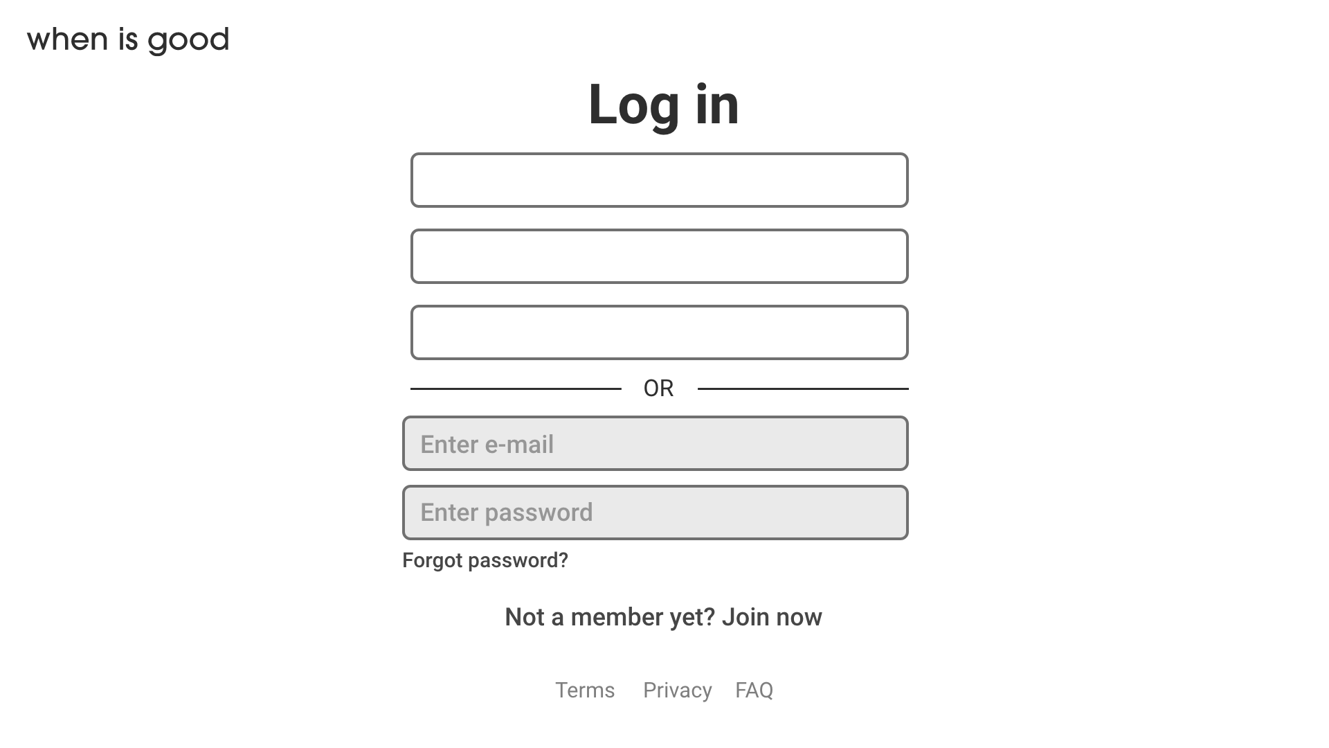
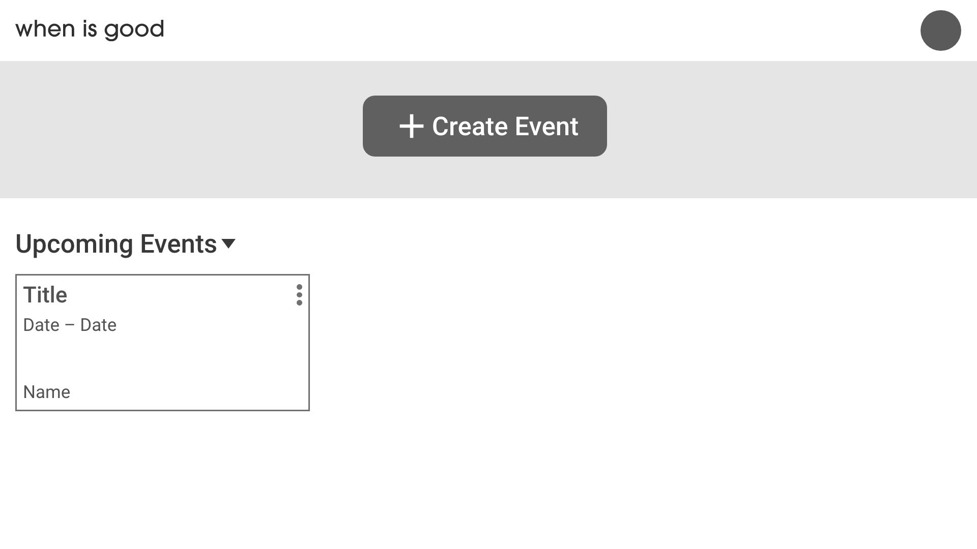
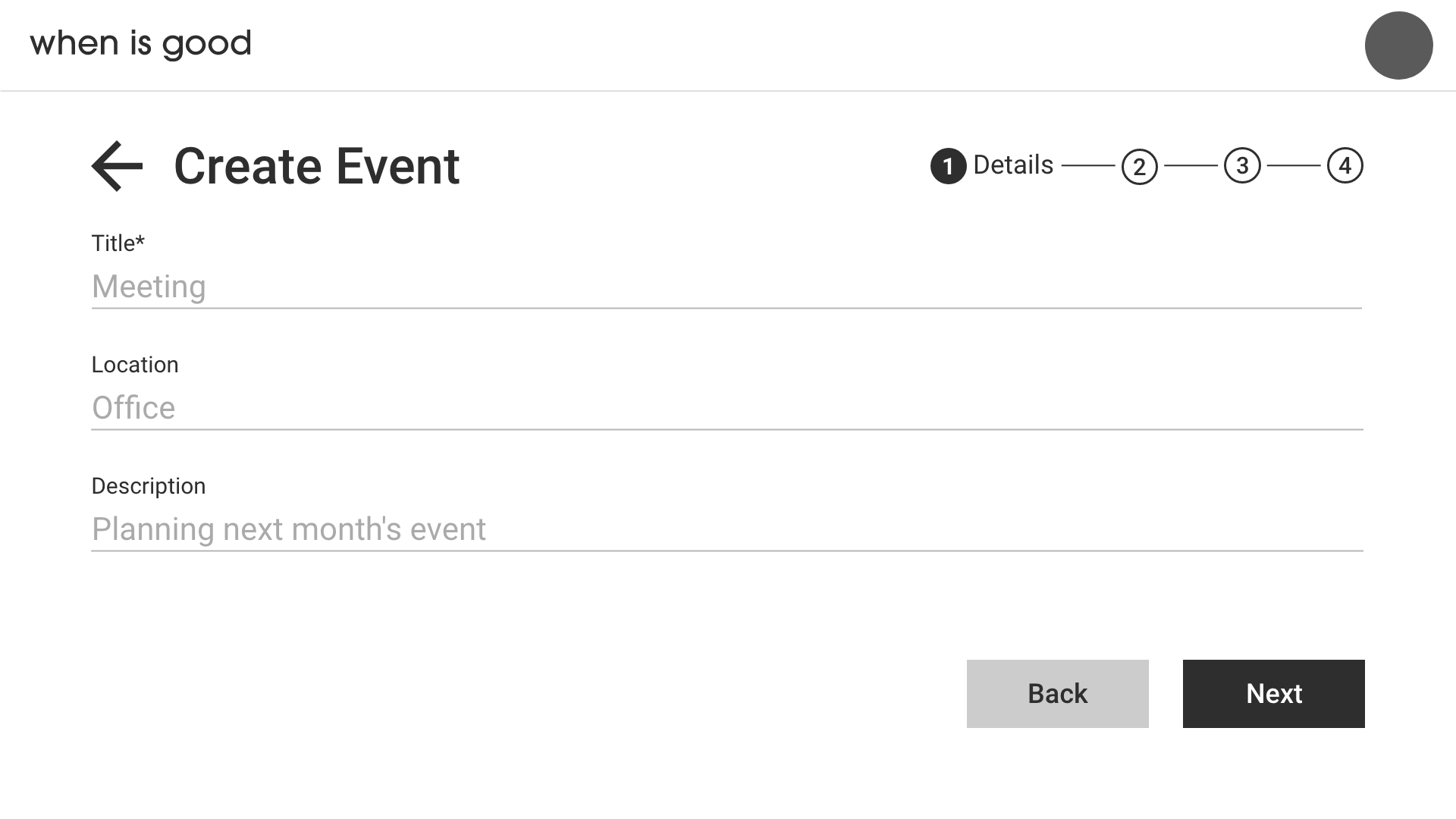
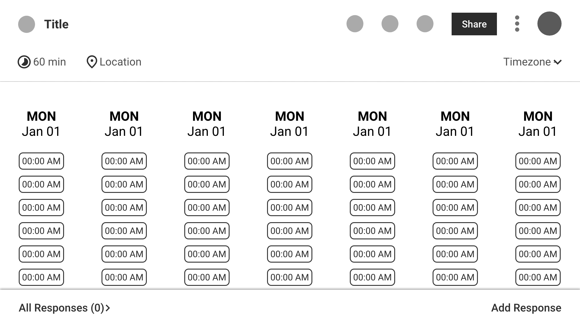
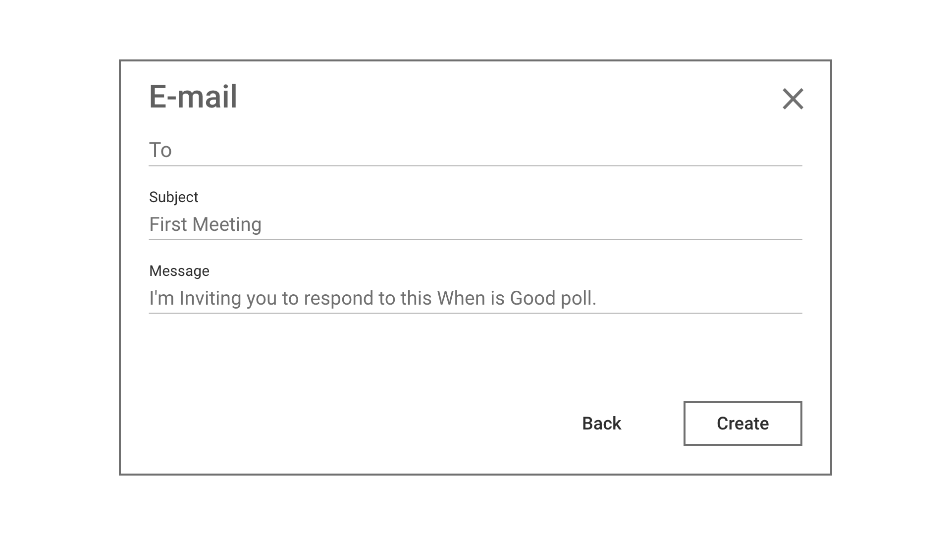
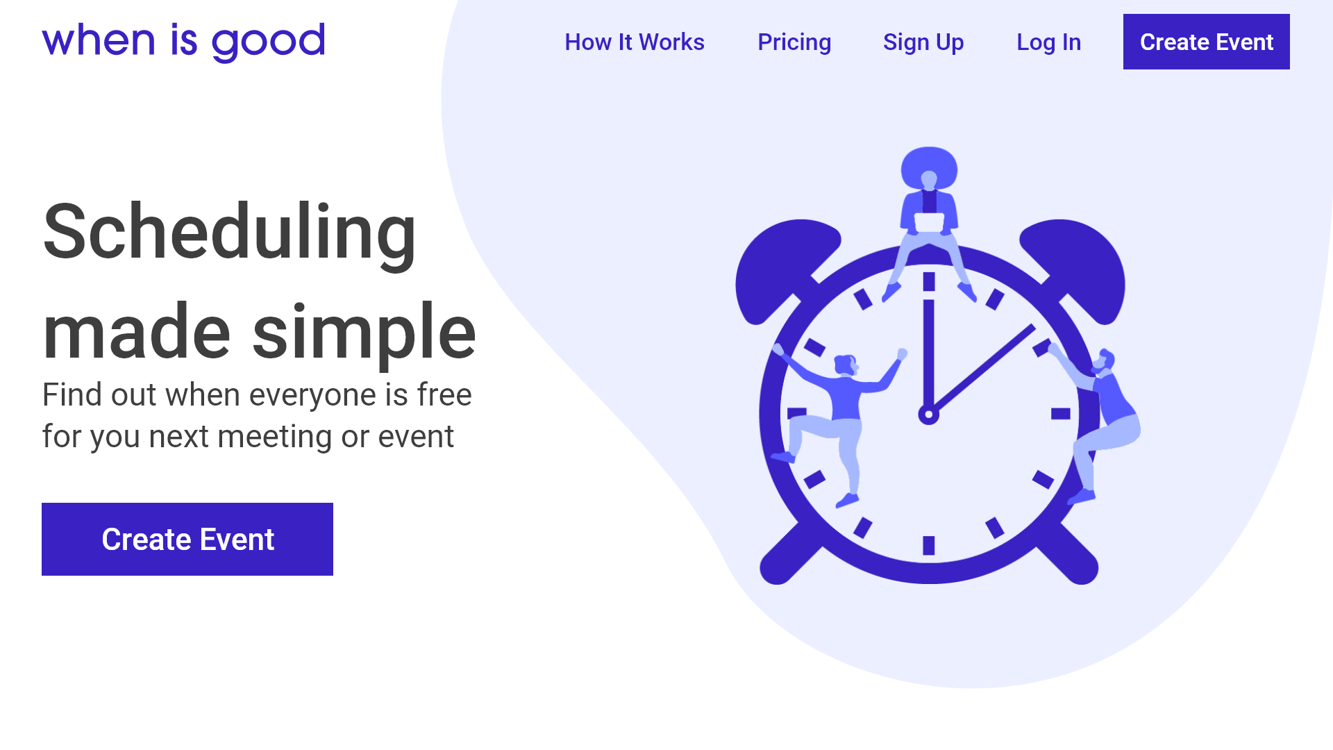
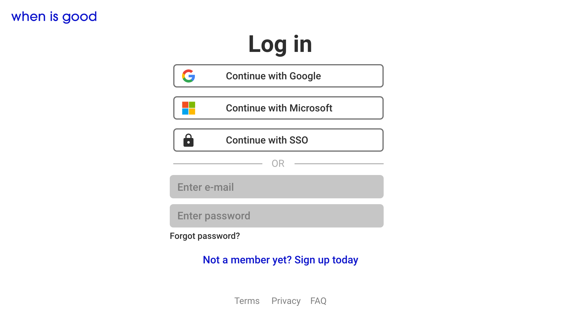
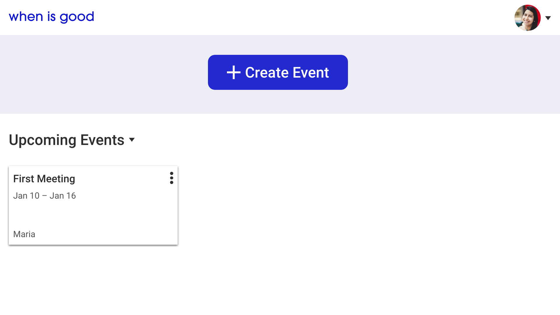
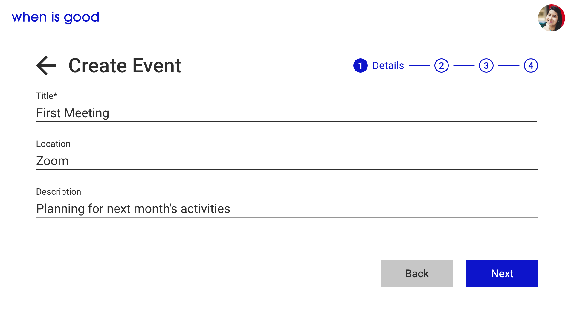
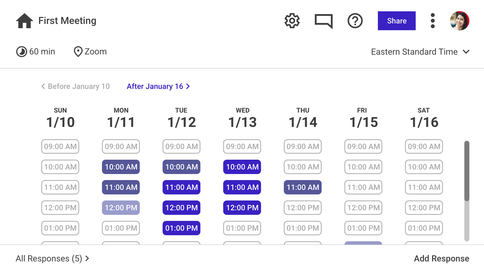
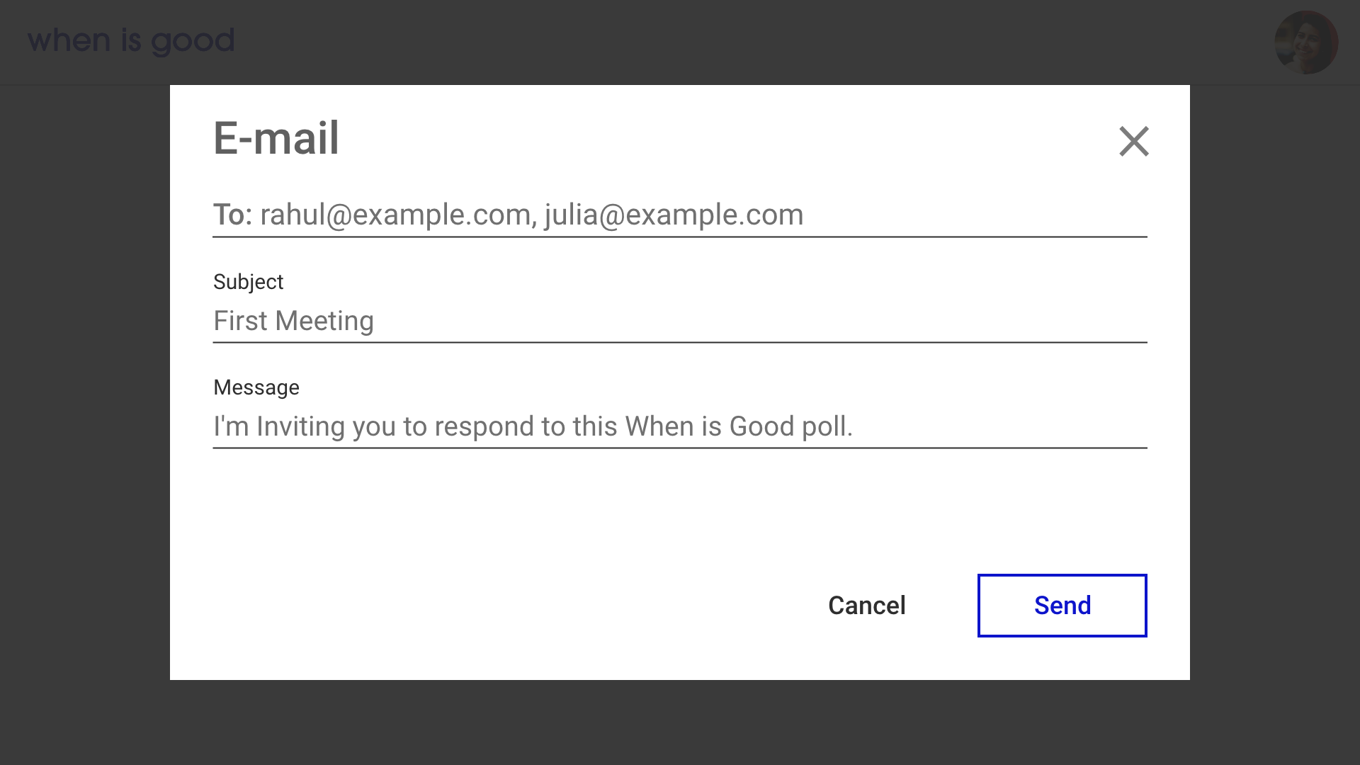
The user flows I created earlier detailed 6 key screens to design wireframes for: Home, Log In, Profile, Create Event, Results, and Share. I placed a major emphasis on presenting information within a minimalist but elegant visual hierarchy.
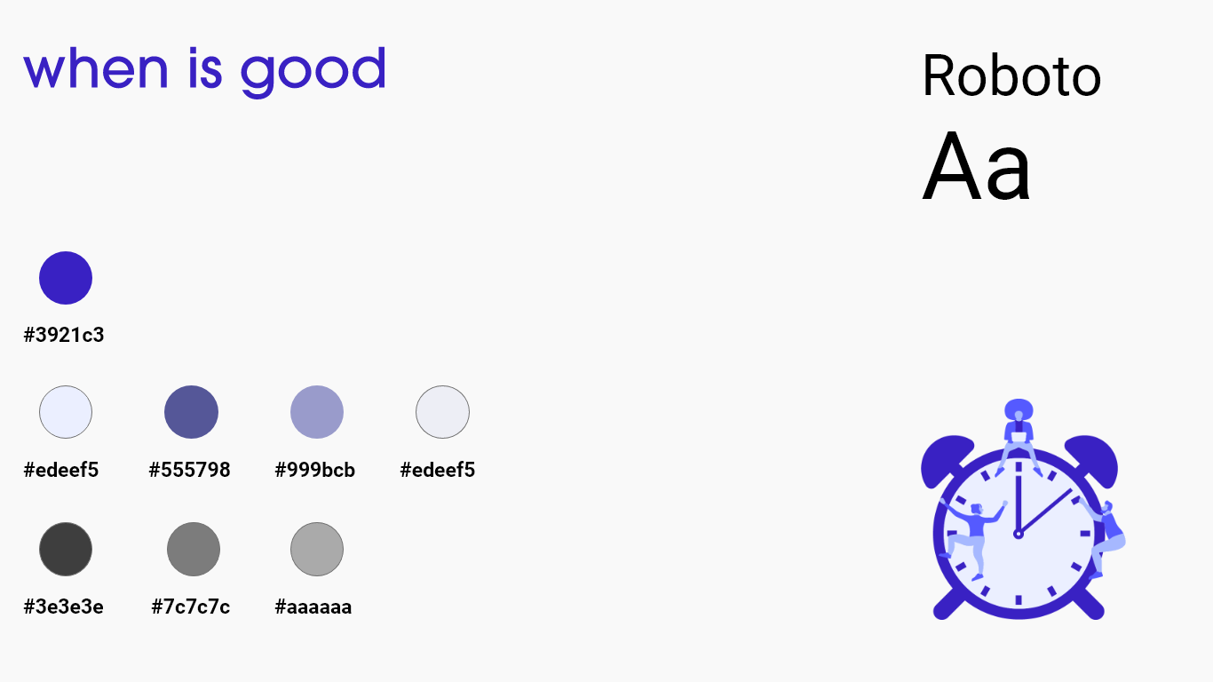
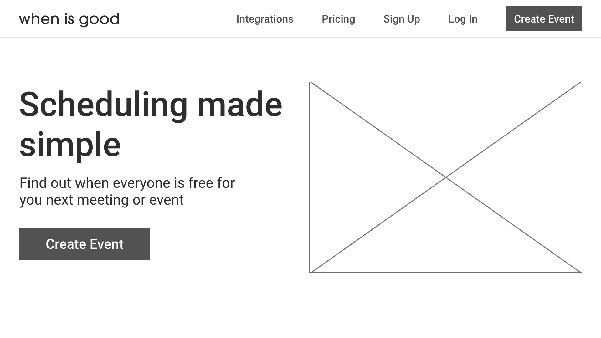
To refine the app's visual identity and design, I sought to incorporate a versatile sans serif typeface like Roboto that would be easy to ready across screens of varying sizes. I also sought to introduce brand colors that would convey the updated When Is Good's dedication to reliability and comfort but also distinguish it from competing apps like Calendly and Doodle. I ultimately chose a vibrant and pleasing purple as the primary brand color with softer purples and greys as accent colors.
With my high fidelity wireframes completed, I could now assemble them into an interactive prototype through Adobe XD. I conducted 5 remote usability tests, asking participants to complete the same tasks as the initial testing phase such as creating an event, changing its details, and viewing its results. I didn't observe any major usability problems during these sessions, so with this data validating my design decisions, I didn't see it necessary to make additional improvements for the time being.
Working on this project challenged me to find creative solutions to user research. Because I am not affiliated with When Is Good and didn't have access to a large pool of their users, I resorted to conducting target user interviews to determine user needs and pain points. I believe that this process was successful, given that I was able to confidently validate my design decisions with 5 rounds of usability testing.


